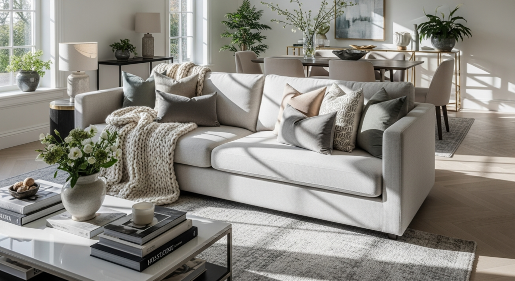
Introduction
Some spaces ask to be lived in loudly. A bedroom is not one of them.
The bedroom is where the day dissolves — where the world’s demands soften into something quieter, more personal, more yours. And no color family understands this better than pastels. Soft, gentle, luminous, and endlessly calming, pastel tones create the kind of atmosphere that wraps around you the moment you step through the door.
Pastel bedrooms have long occupied a sacred corner of interior design — beloved for their ability to make any space feel airy, intimate, and visually restful without sacrificing elegance or personality. Whether your palette leans toward the romance of blush pink, the serenity of powder blue, the freshness of mint green, or the quiet whimsy of lilac, there is a pastel bedroom approach in this guide made precisely for your vision.
These 11 ideas span the full range of pastel design — from barely-there whispers of color to rich, fully committed pastel immersion — each paired with practical design guidance to help you bring the soft and dreamy bedroom you have been imagining to life.
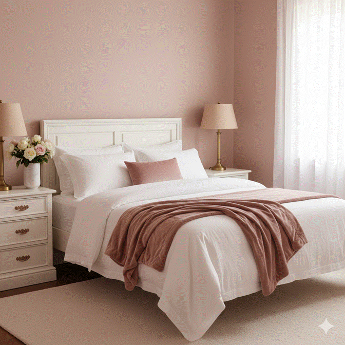
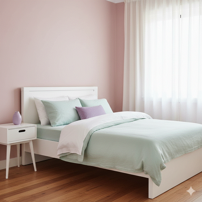
1. Blush Pink Pastel Bedroom — Romance in Every Detail
Blush pink is the most beloved pastel in bedroom design for a reason that goes beyond mere trend. It is the color of softness made visible — warm enough to feel intimate, pale enough to remain restful, and universally flattering in its interaction with natural light. A blush pink bedroom feels, instinctively, like a sanctuary.
The secret to a sophisticated blush bedroom lies in layering. Blush walls provide the warm ground tone, but the depth comes from the layers above: dusty rose linen, ivory cotton, warm white timber furniture, and brass or rose gold hardware that catches the warm undertone of the walls. Each element reinforces the overall warmth without tipping into saccharine territory.
✦ Styling Tip: Choose a blush with a grey or beige undertone rather than a pure pink. Warm-grey blushes feel sophisticated and mature, while pure candy pinks can overwhelm. Test your paint in different lighting conditions — blush reads very differently in morning versus evening light.
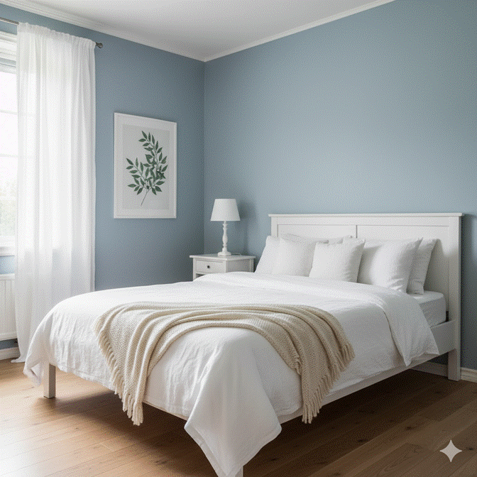
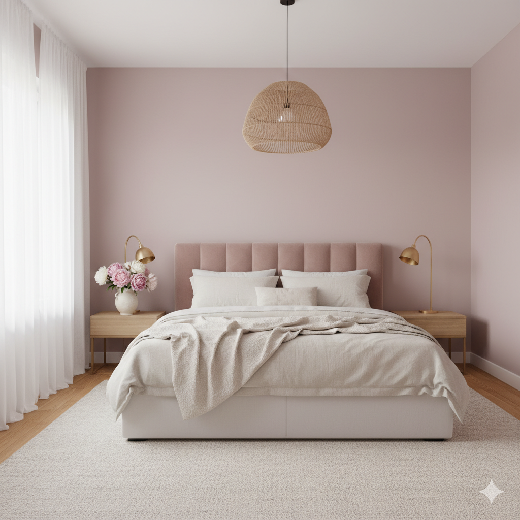
2. Powder Blue Pastel Bedroom — Calm, Airy, and Effortlessly Serene
If there is one pastel that has defined a generation of aspirational bedroom interiors, it is powder blue. Clean, cool, and quietly uplifting, powder blue creates an atmosphere in the bedroom that genuinely feels like breathing more slowly. It is the visual equivalent of an open window on a clear morning.
Powder blue works beautifully across every design style. In a Scandinavian-inspired room, it pairs with white and natural timber for a fresh, Nordic calm. In a more traditional setting, it combines with soft white panelling and antique brass for something closer to a classic country house bedroom. In a contemporary space, it meets crisp white bedding and chrome accents with understated elegance.
✦ Styling Tip: Balance the coolness of powder blue with at least one warm element — a cream wool throw, a honey-toned timber side table, or a pendant with a warm amber glow. Without this warmth, powder blue rooms can feel slightly clinical rather than genuinely restful.
3. Soft Lavender Bedroom — Dreamy, Romantic, and Deeply Restful
Lavender sits at a unique intersection of cool and warm in the pastel family — it carries the calming quality of blue with the gentle warmth of pink, and the result is a bedroom tone that feels genuinely dreamlike. Studies have long associated purple tones with rest and creativity, and soft lavender in the bedroom creates an environment that honours both.
The lavender bedroom excels in its romantic quality. Layered with white lace, gauze curtains that filter afternoon light into something almost violet, and the softness of plush velvet cushions in dusty purple, a lavender bedroom feels like stepping into a beautifully illustrated story — all atmosphere, all softness, all quiet enchantment.
✦ Styling Tip: Avoid mixing lavender with bright whites — the cool tone of pure white can make lavender appear grey or dull. Instead, pair with warm cream whites, antique white, or very soft ivory to maintain the warmth within the purple family.
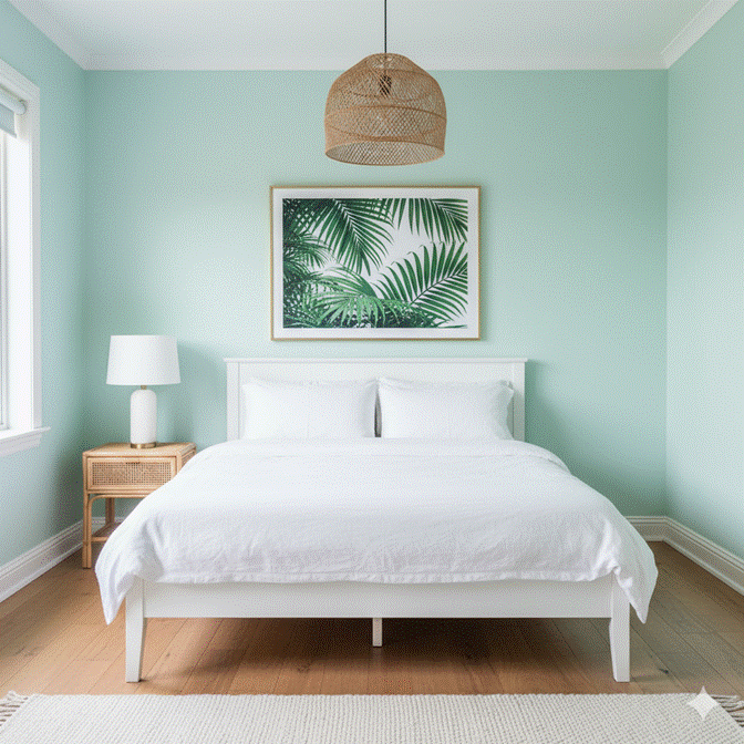
4. Mint Green Pastel Bedroom — Fresh, Light, and Quietly Joyful
Mint green brings a unique energy to the pastel bedroom palette — it carries a freshness and lightness that the warmer pastels cannot quite replicate. Where blush is romantic and lavender is dreamy, mint is quietly joyful: the color of spring mornings, fresh starts, and rooms that seem to breathe.
The mint bedroom works with extraordinary versatility across different design aesthetics. Against warm white and natural rattan, it creates a relaxed coastal feel. Paired with brass and white marble, it achieves a sophisticated contemporary elegance. Combined with soft cream and vintage finds, it leans into a gentle, nostalgic whimsy.
✦ Styling Tip: Mint green is sensitive to undertones — some mint shades pull blue, others pull yellow. In north-facing rooms with cooler light, choose a slightly warmer, creamier mint to prevent the room from feeling cold. In bright south-facing rooms, a cooler, cleaner mint sings beautifully.
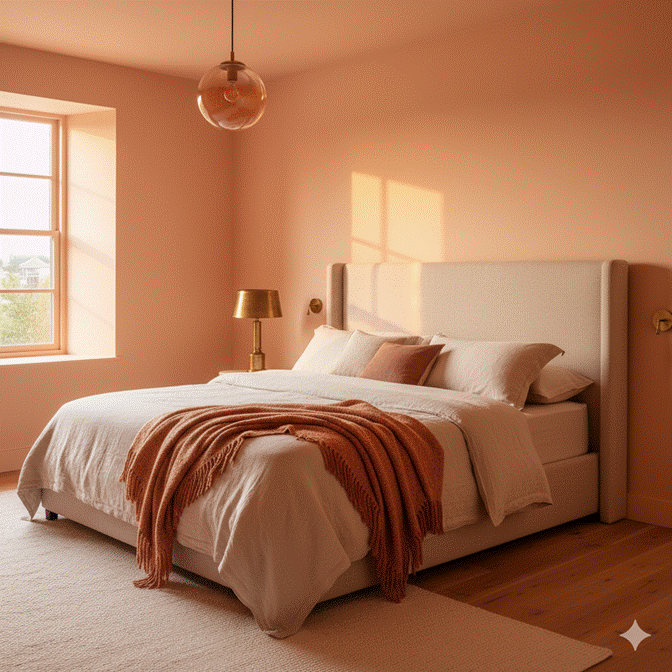
5. Peach and Apricot Pastel Bedroom — Warmth, Glow, and Subtle Drama
Peach and apricot are the warmest members of the pastel family, and they bring a luminosity to the bedroom that cooler pastels simply cannot produce. A peach bedroom catches and amplifies light in a way that makes the room appear perpetually sun-warmed — even on overcast days, the gentle orange undertone of peach creates a sense of inner glow.
This warmth makes peach and apricot particularly well-suited to bedrooms with limited natural light. North-facing rooms that can feel cold in neutral tones are dramatically transformed by a peach or apricot palette, which counters the cool light source with the room’s own warmth. The result is intimate, glowing, and endlessly inviting.
✦ Styling Tip: Layer peach tones from light to deep for a tonal approach that adds dimension without introducing a contrasting color. Start with pale peach walls, move to a slightly deeper apricot in soft furnishings, and anchor the room with a warm terracotta ceramic or one deeper tone in a cushion or throw.
6. Pastel Yellow Bedroom — Sunshine, Optimism, and Gentle Radiance
Pastel yellow in the bedroom is a quiet act of optimism. The very palest lemons and buttery creams carry just enough yellow to introduce warmth and lightness without the stimulating energy of a stronger yellow. They wake the room gently — adding brightness and a sense of morning freshness that feels inherently hopeful.
The key to a pastel yellow bedroom that reads as sophisticated rather than nursery-adjacent lies in its surrounding materials and tones. Aged oak, natural linen, white plaster, and matte ceramics in cream and warm white are the natural companions of pastel yellow — they ground its brightness in organic calm and prevent it from feeling too sweet or too cheerful.
✦ Styling Tip: If committing to pastel yellow walls feels bold, introduce the color through the ceiling instead. A pale butter-yellow ceiling over white walls creates a warm, domed feeling of enclosure — like being inside a gently glowing lantern — that is subtle yet transformative.
7. Mixed Pastel Palette Bedroom — Soft Color Blocking Done with Elegance
Who decided that a bedroom must live within a single pastel tone? The mixed pastel palette bedroom challenges that assumption beautifully — combining two, three, or even four pastel tones in a single space with a sense of playful, curated ease that reads as creative and intentionally considered.
The secret to making a mixed pastel palette work lies in tonal consistency. All chosen pastels should share a similar depth and saturation — equally pale, equally soft. A room where one pastel is significantly stronger than the others will feel unbalanced. When all the pastels share the same whisper-level quiet, they harmonize naturally, like a watercolor palette left to bleed softly into one another.
✦ Styling Tip: Limit mixed pastels to a maximum of three tones and use the rule of proportions: 60 percent of one dominant pastel, 30 percent of a secondary pastel, and 10 percent of an accent pastel in smaller accessories. This keeps the palette cohesive rather than scattered.
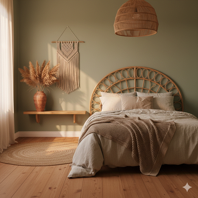
8. Pastel Bedroom with Rattan and Natural Textures — Organic Softness
Pastel tones and natural textures share a profound aesthetic kinship — both belong to a design language of gentleness, simplicity, and connection to the natural world. When combined in a bedroom, they create an environment of extraordinary warmth and organic serenity: the kind of space that feels genuinely restorative simply to occupy.
Rattan is the natural texture most perfectly aligned with pastel bedroom design. The warm, honey-toned weave of rattan furniture — a bedside table, a hanging pendant light, a woven headboard — introduces organic dimension against a soft pastel wall without disrupting the palette’s quiet atmosphere. It feels inherently unhurried: the furniture equivalent of a long exhale.
✦ Styling Tip: Combine rattan with linen, cotton, and wool in the bedding and soft furnishings — avoid synthetic fabrics in a natural-texture pastel bedroom, as they introduce a slight sheen that conflicts with the organic matte quality these rooms depend on.
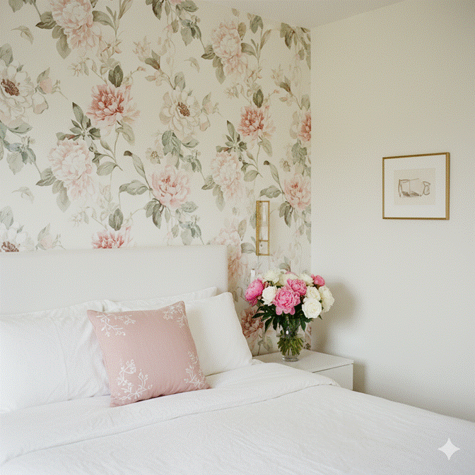
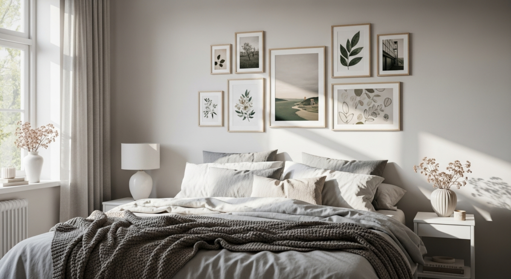
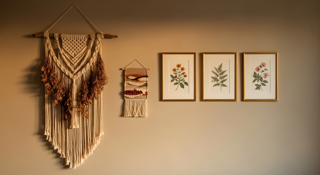
9. Pastel Bedroom with Floral Accents — Timeless, Feminine, and Deeply Romantic
The relationship between pastels and florals in bedroom design is one of the oldest and most enduring pairings in interior history. There is something genuinely timeless about a soft-hued bedroom with carefully chosen floral accents — whether in wallpaper, textile print, or fresh and dried flowers placed throughout the space.
The contemporary approach to pastel florals is more restrained than its Victorian predecessor. A single wall of large-scale floral wallpaper in blush, cream, and sage behind the bed. A small botanical print cluster on a pale lavender wall. A linen duvet with a delicate allover floral in the softest possible version of the palette. The flowers are present — but they whisper rather than shout.
✦ Styling Tip: When using floral wallpaper in a pastel bedroom, confine it to one wall — typically the bed wall — and keep everything else in the room tonally plain. The wallpaper carries the decorative weight; the surrounding walls, bedding, and furniture should retreat into simple complementary tones.
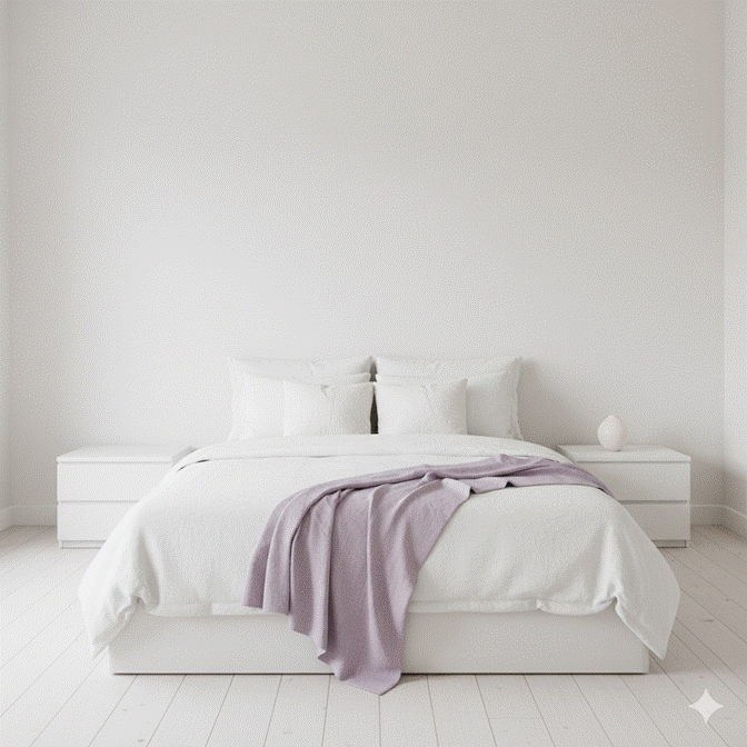
10. Minimalist Pastel Bedroom — When Less Color Says More
The minimalist pastel bedroom occupies a particularly refined corner of this aesthetic territory. Here, pastel is not used as decoration — it is used as architecture. A single carefully chosen pastel tone applied to one surface — the wall, the bedding, or even a single large textile — becomes the room’s entire emotional statement.
Everything else in a minimalist pastel bedroom is white, natural, or neutral. The furniture is unfussy. The bedding is simple. The accessories are few and intentional. And within this serene emptiness, the pastel element — even if present in only a folded throw or a single vase — resonates with clarity and quiet confidence.
✦ Styling Tip: In a minimalist pastel bedroom, the quality of every material becomes visible and critical. Choose the best linen you can afford — the weight and drape of high-quality linen elevates a minimal room enormously. Cheap fabrics in minimal spaces have nowhere to hide.
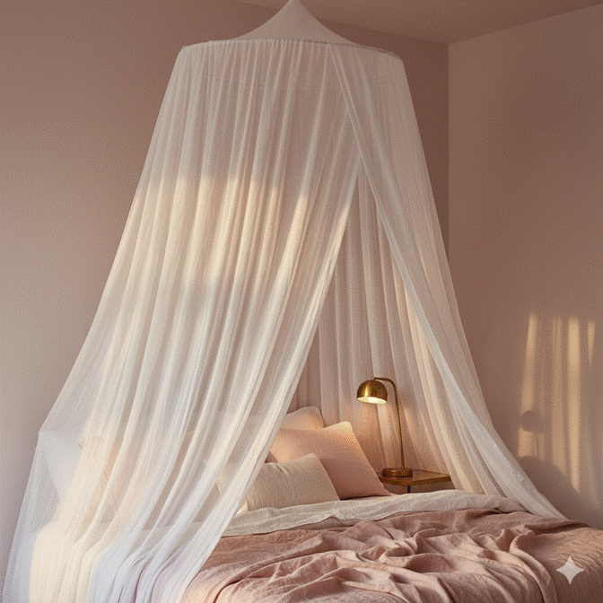
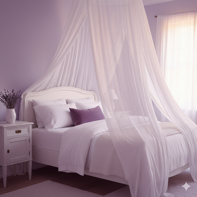
11. Pastel Bedroom with Canopy or Curtain Draping — Dreamy Architecture
A bed canopy or draped curtain treatment transforms a pastel bedroom from beautiful to genuinely enchanting. The addition of soft, flowing fabric above or around the bed introduces a sense of enclosure and intimacy that makes the sleeping space feel like its own world within the room — a soft architecture of fabric that the dreamy pastel palette has always been pointing toward.
Sheer white or blush gauze panels hung from a ceiling-mounted ring directly above the bed create a classic canopy effect with minimal construction. Full-length curtain panels mounted at ceiling height on either side of the bed and drawn partially across create a more dramatic, theatrical version of the same principle. Both approaches make the bed feel like the most special seat in the most special room.
✦ Styling Tip: Use only sheer, lightweight fabrics for bed canopies in pastel rooms — heavy draping materials introduce a visual weight that conflicts with the airiness these spaces depend on. Sheer linen, muslin, voile, or silk organza in white or the palest version of your room’s pastel tone all work beautifully.
Conclusion — The Soft Power of a Pastel Bedroom
Pastel bedrooms endure in interior design not because they are fashionable — though they always are — but because they are fundamentally aligned with what a bedroom should feel like. They are gentle without being timid, beautiful without being demanding, personal without being inaccessible.
The 11 ideas in this guide cover every register of pastel bedroom design: from the bold romance of a full blush environment to the quiet restraint of a single lavender throw on an otherwise neutral bed. Each approach honors the core promise of pastel design — that a bedroom can be both visually beautiful and genuinely, deeply restful.
Choose your palette, layer your textures, and let the softness do exactly what it has always done best: make a space feel like it was made for you.
Frequently Asked Questions
Q: What are the best pastel colors for a small bedroom?
A: Powder blue, soft mint, and pale blush are among the most effective pastels for small bedrooms. These tones reflect light readily and create an airy, open quality that makes a room feel larger than its dimensions suggest. Avoid applying deep or warm pastels like peach or apricot to all four walls in a small room — these can create a more enclosing effect. An accent wall approach works well for introducing warmth in a compact space.
Q: How do I stop a pastel bedroom from looking too childlike?
A: The key is in the materials and proportions. Ground pastel wall colors with grown-up textures: linen, velvet, aged timber, brass or antique gold, and marble. Choose clean-lined, adult furniture rather than rounded or cartoonish forms. Keep patterns minimal and refined — a subtle geometric or a large-scale botanical print rather than novelty prints. Finally, introduce one or two darker anchor tones — deep navy cushions, a dark timber frame — to give the room visual weight.
Q: What lighting works best in a pastel bedroom?
A: Warm-toned lighting is essential in a pastel bedroom. Cool or blue-toned bulbs make pastels appear grey and dull. Choose bulbs in the 2700K to 3000K range — these warm, amber-adjacent tones bring out the inherent warmth in pastels and create the soft, glowing atmosphere these rooms are designed to evoke. Layered lighting — an overhead fitting plus bedside lamps plus a floor lamp or wall sconce — allows for adjustable mood and prevents the flat effect of a single central light source.
Q: Can pastel bedrooms work for adults or are they only for children?
A: Pastel bedrooms are, if anything, more sophisticated in adult design contexts than in children’s rooms. The approach differs primarily in material quality and design restraint — adult pastel bedrooms rely on premium textiles, considered furniture, deliberate accessorizing, and the layering of soft textures rather than thematic decoration. Interior designers regularly specify pastel palettes for luxury hotel suites, high-end residential projects, and editorial spaces precisely because of their sophisticated, calming character.
Q: How do I layer different textures in a pastel bedroom?
A: Start with the largest surfaces: walls in a matte pastel paint, flooring in warm timber or a soft textured carpet. Add the bedding layer: crisp linen sheets, a plush duvet, and a lightweight knit or velvet throw at the foot. Introduce cushions in varying textures — velvet, woven cotton, embroidered linen — in tonal variations of your pastel. Add rugs in natural fibres like wool or jute, curtains in linen or sheer voile, and finally small ceramic and glass accessories. This progression from large to small, flat to dimensional, is what creates the layered richness of a well-styled pastel bedroom.