Introduction
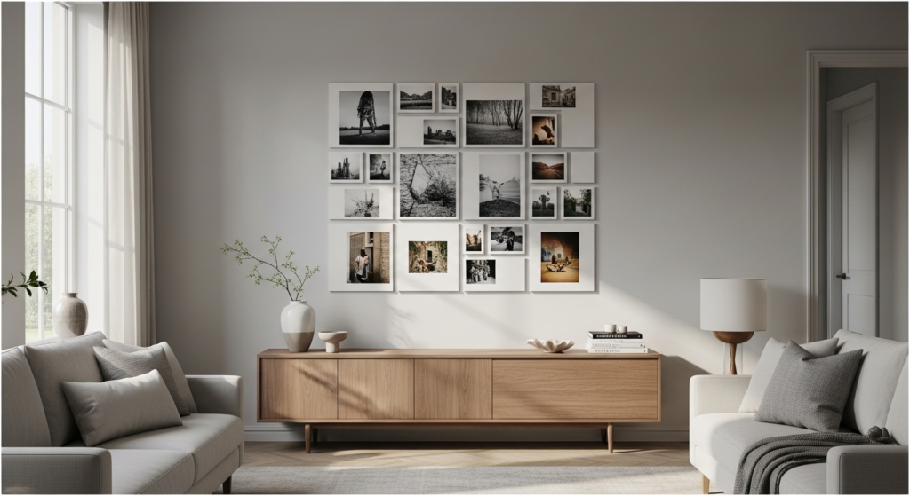
A thoughtfully designed photo wall has the power to transform an ordinary space into a deeply personal and visually captivating feature. The 8×8 photo wall layout, with its structured symmetry, offers a perfect balance between creativity and order.
Whether styled in a minimalist interior or layered within a cozy setting, this layout creates a gallery-like presence that feels both curated and intentional. With the right spacing, lighting, and tonal harmony, your photo wall can become a timeless focal point that enhances the overall ambiance of your home.
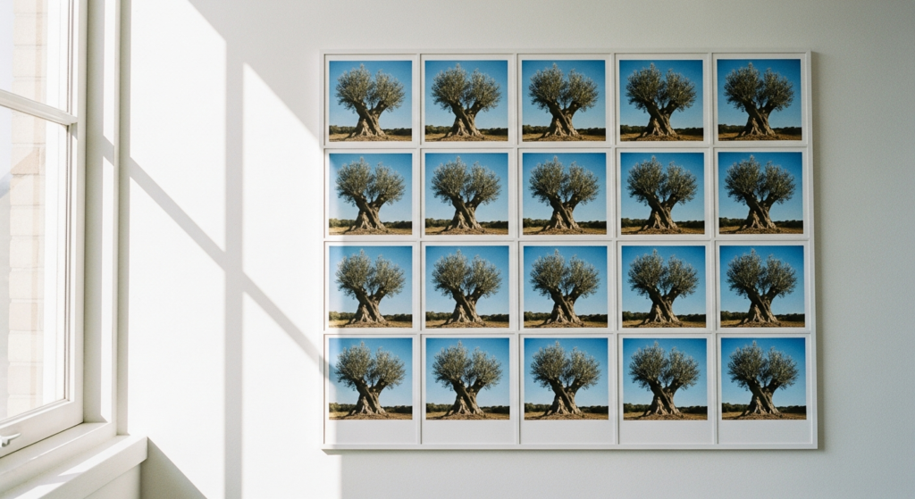
1. Classic Symmetrical Grid Layout
A perfectly aligned 8×8 grid creates a clean and structured aesthetic. This layout feels organized and visually calming.
Use identical frames and equal spacing for consistency. Position on a central wall where natural light highlights the arrangement.
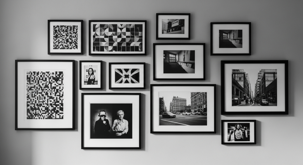
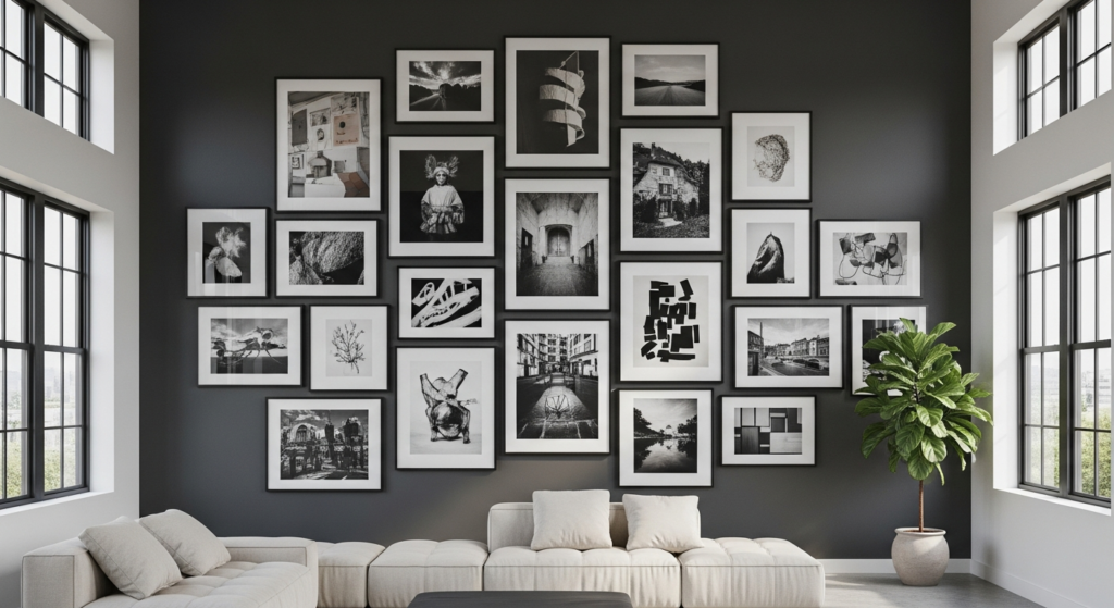
2. Black and White Minimalist Grid
A monochrome palette adds sophistication and timeless appeal.
Choose black frames with white matting or vice versa. This contrast enhances visual clarity and creates a gallery-inspired look.
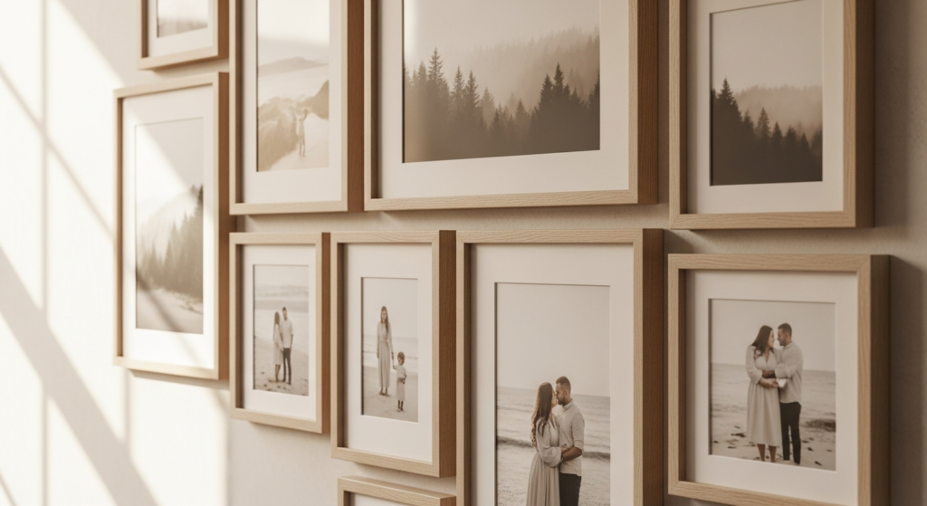
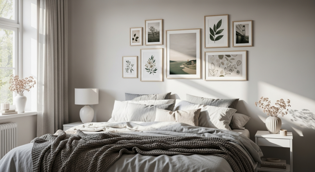
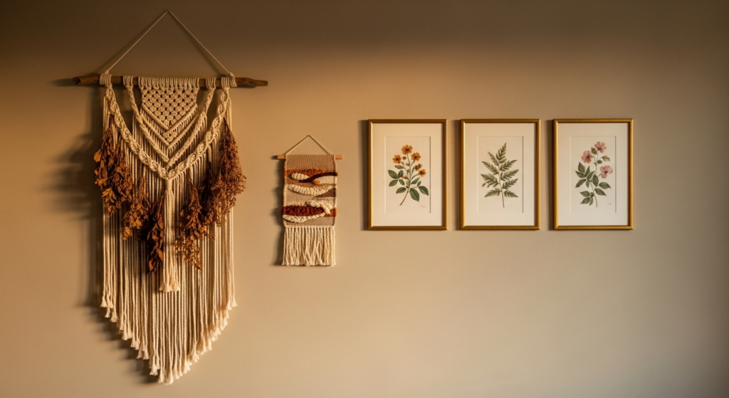
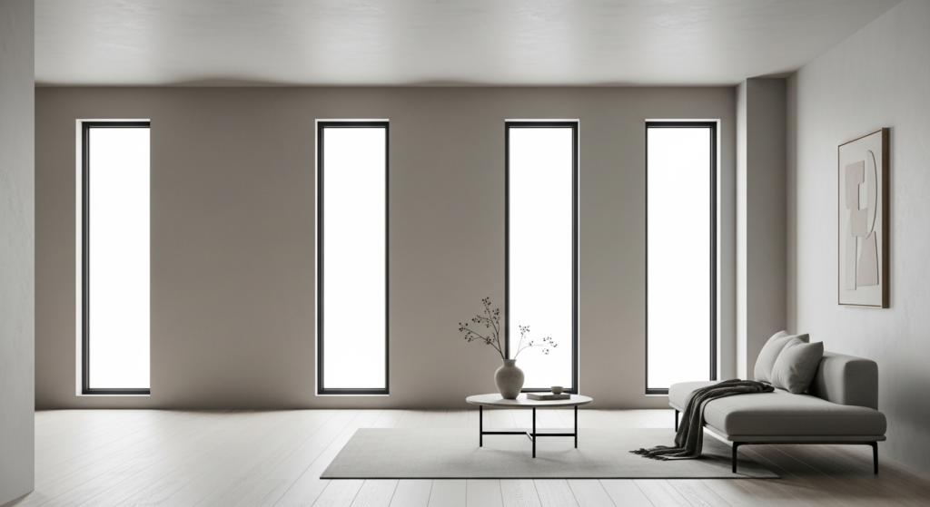
3. Soft Neutral Tone Gallery Wall
Neutral-toned photos create a cohesive and calming visual effect.
Stick to beige, soft grey, and warm whites. Pair with light wood frames for added warmth and texture.
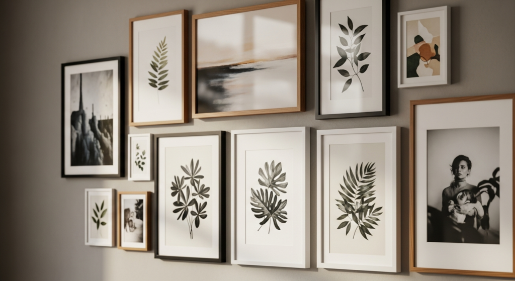
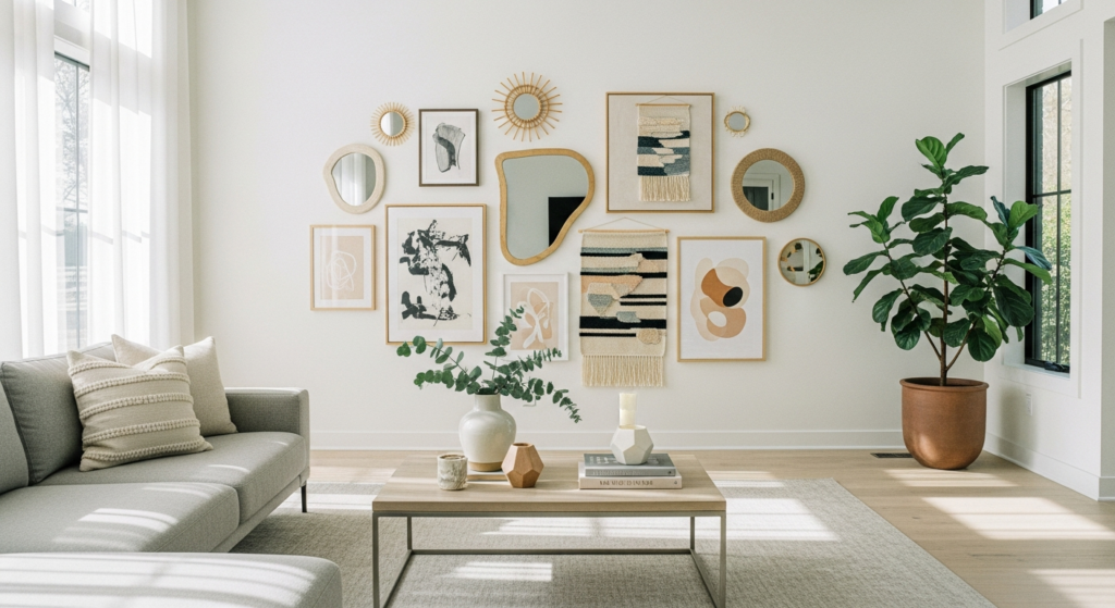
4. Mixed Frame Texture Layout
Combining different frame materials introduces depth while maintaining the grid structure.
Mix wood, metal, and matte finishes. Keep colors within a cohesive palette to avoid visual clutter.
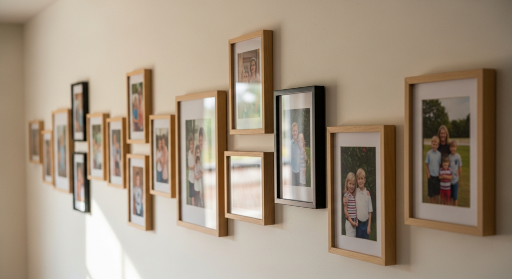
5. Storytelling Memory Wall
Use the 8×8 grid to tell a chronological or thematic story.
Arrange photos by events or moods. Keep spacing consistent to maintain structure while allowing content to shine.
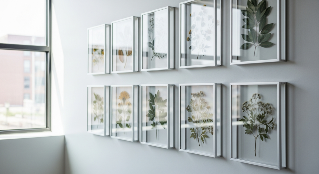
6. Floating Frame Illusion Layout
Frames with transparent edges create a floating effect that feels modern and airy.
Use thin borders and minimal hardware. Position against light-colored walls for maximum impact.
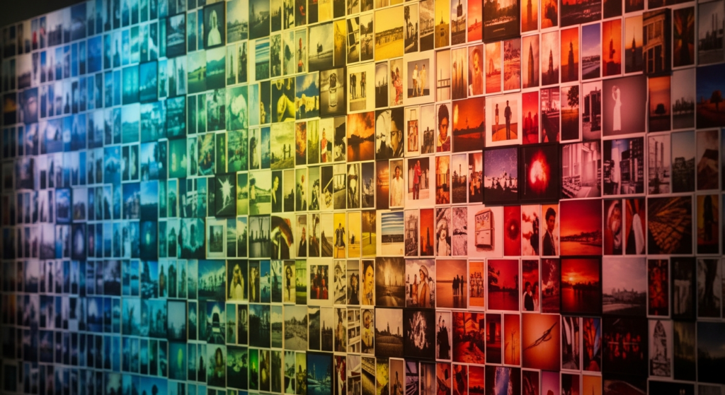
7. Color-Coordinated Photo Grid
Organizing photos by color creates a visually striking gradient or pattern.
Start with darker tones at one end and transition to lighter shades. This technique adds artistic depth to the layout.
8. Polaroid-Inspired Layout
Using square prints without heavy frames creates a casual, relaxed aesthetic.
Mount photos with subtle spacing or clips. This style works beautifully in creative or youthful interiors.
9. Large-Scale Statement Wall
An 8×8 layout can act as a bold focal point in spacious rooms.
Use larger prints for impact. Ensure proper spacing to maintain balance and avoid overcrowding.
10. Minimal Frame with Wide Spacing
Increasing the spacing between frames creates a more open and breathable design.
Use slim frames in neutral tones. This approach works well in minimalist interiors.
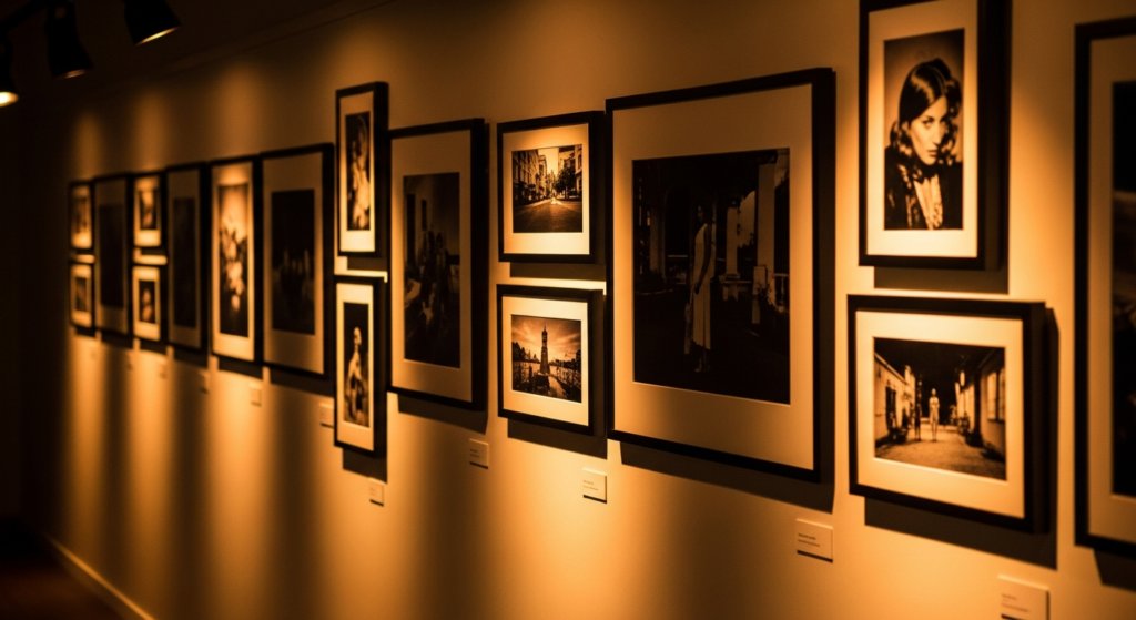
11. Gallery Wall with Accent Lighting
Lighting enhances the visual appeal of your photo wall.
Use wall-mounted lights or spotlights. Warm lighting highlights textures and adds a luxurious ambiance.
Conclusion
An 8×8 photo wall layout is more than just a decorative feature—it’s a reflection of personal style and thoughtful design. With its structured format, it offers endless opportunities to experiment with textures, tones, and visual storytelling.
By focusing on balance, spacing, and lighting, you can create a gallery wall that feels both elegant and inviting. Whether minimalist or layered, the right layout transforms your wall into a stunning centerpiece.
FAQs
1. What is an 8×8 photo wall layout?
It is a grid arrangement of 64 photos, typically evenly spaced to create a structured and visually balanced display.
2. How much space should be between frames?
A gap of 1–2 inches is ideal for a clean and consistent look.
3. Can I mix frame styles in an 8×8 layout?
Yes, but keep colors and textures cohesive to maintain a harmonious design.
4. Where should I place an 8×8 photo wall?
It works best on large, open walls such as living rooms, hallways, or above sofas.
5. How do I make my photo wall look more modern?
Use neutral tones, minimal frames, and incorporate proper lighting for a refined, contemporary feel.